Project Views & Actions
Applies to: All tiers Last updated: 26-Feb-2026
Overview
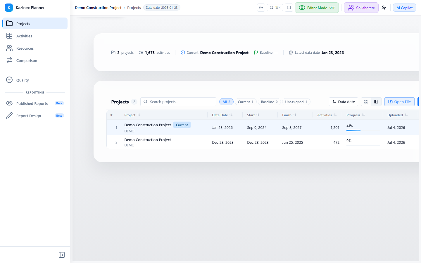
The Projects tab displays all uploaded schedules in your workspace. Switch between a Cards view (visual grid) and a Table view (sortable list), use Quick Filters to narrow results, and manage each project through an Actions Menu. A Portfolio Stats hero section shows aggregated metrics at the top.
Portfolio Stats (Hero Section)
At the top of the Projects tab, the Portfolio Pulse hero surface displays key performance indicators drawn from your current and baseline projects.
| Metric | Description |
|---|---|
| Current Project | Name and data date of the project marked as Current |
| Activity Count | Total activities in the current project |
| Timeline Metrics | Start, finish, and duration compared to baseline |
| Performance Deltas | Positive/negative indicators comparing current vs baseline |
The hero section uses animated numbers and mini progress bars for a quick visual overview. It loads lazily for performance.
Cards View
The default view renders each project as a glassmorphic card in a responsive grid.
Card Layout
Each card displays:
| Element | Description |
|---|---|
| Project Name | Full name (truncated at 72 characters) |
| Role Badge | Current (blue), Baseline (green), Archived (grey), or None |
| Project ID | Short project identifier |
| Data Date | Last schedule calculation date |
| Activity Count | Number of activities in the schedule |
| Upload Date | When the file was uploaded |
| File Name | Original uploaded file name |
Card Actions
The card footer provides quick action buttons:
| Button | Description |
|---|---|
| Set as Current | Mark this schedule as the active current version |
| Set as Baseline | Mark this schedule as the comparison baseline |
| Delete | Remove the project (with confirmation) |
A three-dot menu (⋮) on each card opens additional options — see Actions Menu below.
Responsive Layout
| Screen Width | Columns |
|---|---|
| ≥ 1200 px | 3 columns |
| ≥ 768 px | 2 columns |
| < 768 px | 1 column |
For workspaces with more than 48 projects, the grid uses virtualisation for smooth scrolling.
Accessibility
Cards include role="button", tabIndex={0}, aria-labelledby, and aria-describedby attributes. A screen-reader-only summary span describes the project state.
Table View
Switch to Table view for a sortable, column-based list of all projects.
Columns
| Column | Sortable | Description |
|---|---|---|
| # | — | Row number |
| Project Name | Yes | Project full name + short name |
| Role | Yes | Role badge (sorted: Current → Baseline → None) |
| Data Date | Yes | Schedule data date |
| Activities | Yes | Activity count |
| Actions | — | Inline buttons + actions menu |
Features
- Sort by clicking any column header — an arrow icon indicates sort direction
- Resize columns by dragging the column borders
- Column widths are persisted across sessions
- Each row has inline Set Current and Set Baseline buttons plus the full Actions Menu
- The table is horizontally scrollable on narrow screens
Quick Filters
A pill-style filter rail sits above the project grid (or table). Toggle filters to narrow the displayed projects.
Filter Groups
| Group | Options | Description |
|---|---|---|
| Status | Current, Baseline, None | Filter by role assignment |
| Recency | Recent, Older | Filter by upload date freshness |
Each pill shows the matching project count as a badge. Active filters are highlighted. Click Clear All to reset.
Actions Menu
Every project card and table row includes a three-dot menu (⋮) with the following actions:
| Action | Description |
|---|---|
| Set as Current | Mark as the active schedule (disabled if already current) |
| Set as Baseline | Mark as the baseline schedule (disabled if already baseline) |
| Archive | Archive the project (disabled if already archived) |
| Export XER | Download as Primavera P6 .xer file |
| Export PMXML | Download as Oracle PMXML .xml file |
| Export MS Project | Download as MSPDI .xml file |
| Export Kazinex (.kaz) | Download as native Kazinex binary file |
| Delete | Permanently remove the project (highlighted in red, separated by divider) |
Deleting a project is permanent and cannot be undone.
Role Badges
Role badges appear on both card and table views to visually distinguish project assignments:
| Role | Colour | Label |
|---|---|---|
| Current | Blue | "Current" |
| Baseline | Green | "Baseline" |
| Archived | Grey | "Archived" |
| None | Grey | "—" |
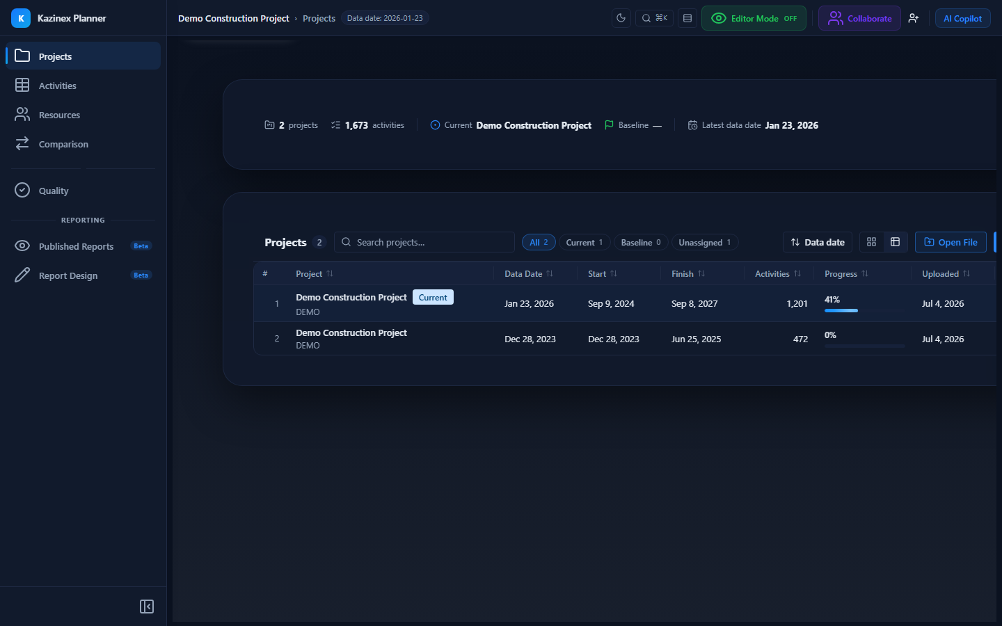
Badges are theme-aware — colours adapt to light and dark modes.
Stats Cards (Compact)
Below the hero section, three stat cards provide a quick summary:
| Card | Content |
|---|---|
| Schedule Roles | Names of the Current and Baseline projects (clickable to scroll to the row) |
| Total Projects | Count of all uploaded projects |
| Activities (Sum) | Total activities across all projects |
Tips & Best Practices
- Use Cards view for a visual overview when you have a handful of projects; switch to Table view for larger portfolios
- Quick Filters are especially helpful when you have 10+ projects — filter by Status to quickly find your Current and Baseline schedules
- The hero section updates automatically when you change Current or Baseline assignments
- Use the Export options in the Actions Menu to quickly share schedules with team members in their preferred format
Related Documentation
- Uploading Schedules — How to import schedule files
- Import Wizard — Step-by-step import walkthrough
- Current & Baseline Marking — Setting up schedule comparison
- Supported Formats — Import and export format details