Interface Overview
Applies to: All tiers Last updated: 26-Feb-2026
Overview
Kazinex runs entirely in your browser as a single-page application. This page covers the core interface elements: theme system, tab navigation, responsive layout, and the client-side processing model that keeps your data private.
Theme System
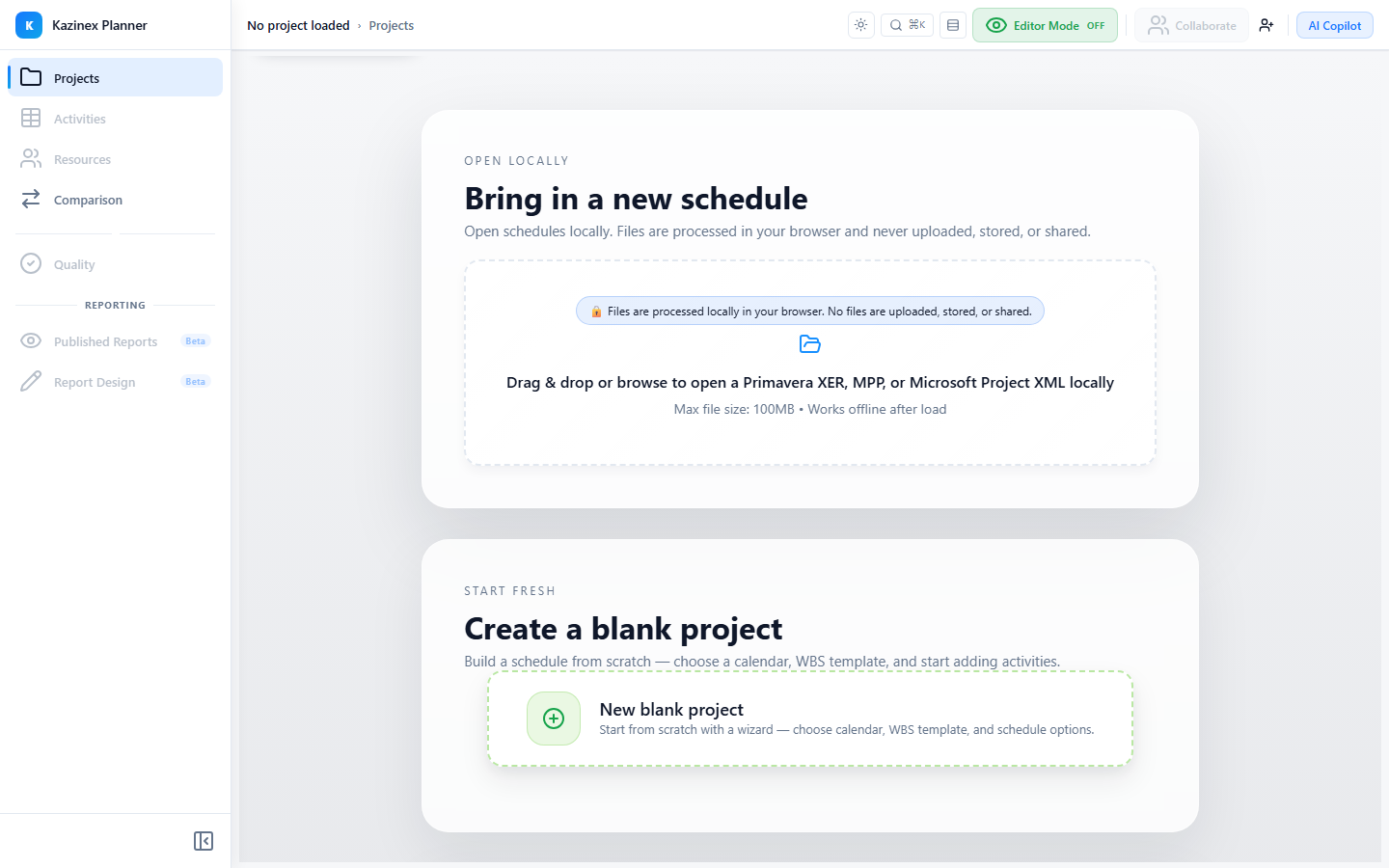
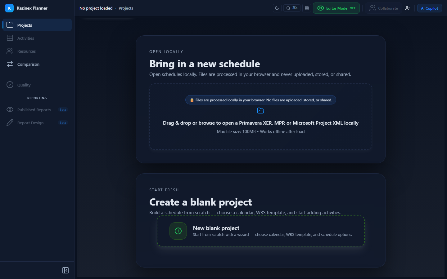
Kazinex uses a Fluent UI-compatible theme built on the P6 design token system.
| Feature | Description |
|---|---|
| Light Mode | Default. Clean white and slate surfaces with teal accents |
| Dark Mode | Detected automatically from your browser or OS preference |
| Glassmorphism | Frosted-glass card surfaces with backdrop-filter: blur() effects |
| P6 Tokens | Colour palette inspired by Primavera P6 with 16 brand variants (shades 10–160) |
The theme adapts automatically — there is no manual toggle. All components, including the Gantt chart, grid, dialogs, and cards, respect the active theme.
Tab Navigation
The main interface is organised into tabs. The tab bar adapts to your screen size:
Desktop (1024 px and above)
Full-width horizontal tabs with icons, labels, hover effects, and keyboard navigation. An animated ink bar highlights the active tab.
Tablet (768–1023 px)
Compact horizontal tabs with smaller icons and labels. Uses the same ink bar animation in a tighter layout.
Mobile (below 768 px)
A bottom navigation bar replaces the top tabs — similar to iOS and Android native apps. Features:
- Fixed to the bottom of the screen
- Touch-friendly targets (minimum 48 px)
- Glassmorphism background effect
- Safe area insets for devices with notches
aria-current="page"on the active tab
Available Tabs
| Tab | Description |
|---|---|
| Projects | Upload and manage schedules |
| Activities | Grid + Gantt view of activities |
| Comparison | Compare current vs baseline |
| Quality | Run and review quality checks |
| Resources | Resource management and histograms |
| Editor | Create and modify schedules (Pro+) |
| AI Copilot | Chat with the AI assistant (Pro+) |
Responsive Layout
The interface adapts across four breakpoints:
| Breakpoint | Width | Layout |
|---|---|---|
| Mobile | < 768 px | Single column, bottom nav, drawers slide from bottom |
| Tablet | 768–1023 px | Two columns where applicable, compact tabs |
| Desktop | 1024–1279 px | Full multi-panel layout, side drawers |
| Large Desktop | ≥ 1280 px | Extra column space, wider panels |
Responsive Behaviours
| Element | Mobile | Desktop |
|---|---|---|
| Spacing | 12 px padding, 8 px gutters | 24 px padding, 16 px gutters |
| Modals | 95% viewport width | Fixed pixel width |
| Drawers | Slide from bottom | Slide from right |
| Project Grid | 1 column | 3–4 columns |
| Touch Targets | Minimum 44 px (Apple/Google guideline) | Standard button sizes |
Client-Side Processing
All schedule parsing, quality analysis, and editing happens entirely in your browser. No schedule data is uploaded to any server.
Privacy Guarantees
| Guarantee | Detail |
|---|---|
| Zero server uploads | No file upload endpoints exist — parsing is 100% client-side |
| Instant processing | No network latency for file analysis |
| Works offline | Once the app is loaded, core analysis features work without an internet connection |
| GDPR compliant | No schedule data collection means automatic compliance |
| No backend vulnerabilities | Your files cannot be breached on a server because they are never sent to one |
| Local storage only | Only lightweight metadata (settings, preferences) is stored in browser storage |
Trust Badges
Throughout the application, Trust Badges confirm that processing is client-side:
- A compact pill badge in the comparison selector reads: "Client-side processing • Your files never leave this browser"
- The Security page on the marketing site provides full details
Error Boundaries
If an unexpected error occurs in any section of the app, an error boundary catches it and displays a recovery message instead of crashing the entire application. You can reload just the affected section without losing work in other tabs.
Tips & Best Practices
- If the interface feels cramped, try zooming out your browser (Ctrl+Minus) or expanding the window
- On mobile, swipe between tabs using the bottom navigation bar
- Dark mode activates automatically based on your system preference — no manual toggle is needed
- All data stays in your browser. You can verify this by opening your browser's Network tab — no schedule data is transmitted
Related Documentation
- Keyboard Shortcuts — All keyboard shortcuts
- Supported Formats — Import and export formats
- Security — Full security and privacy details